Data Visualization Tools Reshaping Multi-Event Wagering Strategies
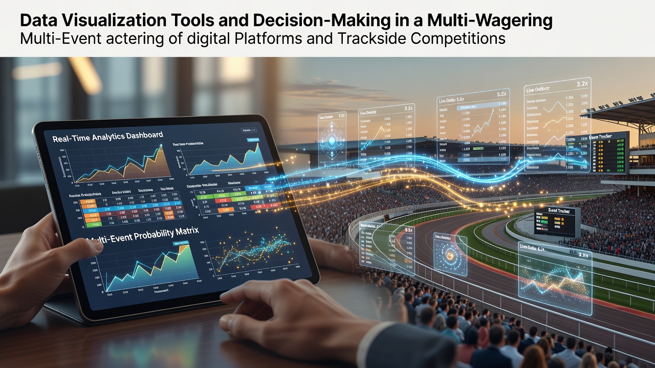
Multi-event wagering involves combining multiple outcomes across sports, horse races, and other competitions into single bets that require coordinated analysis of odds, historical performance, and real-time variables, and data visualization tools now supply the graphical interfaces that allow bettors to process these layers simultaneously. Researchers at institutions studying gambling behavior have documented how platforms integrate heatmaps, trend lines, and interactive charts to display correlations between events that would otherwise remain buried in raw datasets. Observers note that these tools reduce cognitive load by converting numerical probabilities into visual patterns, enabling quicker identification of value across accumulators and parlays whether users operate on mobile apps or at trackside terminals.
Core Mechanisms Behind Visualization in Wagering
Experts have observed that effective visualization begins with layered data feeds that pull live odds, past results, and environmental factors into unified displays, and this integration lets users apply filters for variables such as track conditions or player fatigue without switching between separate screens. Data shows that color-coded probability matrices highlight discrepancies between implied and actual likelihoods, while time-series graphs track momentum shifts across linked events in a single view. Those who study platform design report that drag-and-drop interfaces for building multi-leg bets update projected payouts instantly, and the visual feedback loop supports iterative adjustments before final confirmation.
Applications Across Digital Platforms
Digital platforms employ responsive dashboards that adapt to device screens and allow simultaneous monitoring of soccer leagues, tennis tournaments, and racing fixtures, and figures from industry reports indicate that adoption of these systems rose notably by July 2026 as operators expanded API connections to third-party data providers. Users access scatter plots comparing historical strike rates against current market movements, which helps isolate combinations where combined odds exceed expected values derived from independent probabilities. According to analyses from the National Council on Problem Gambling, such tools also incorporate responsible gaming prompts through visual alerts when stake patterns deviate from user-defined limits, though the primary function remains analytical support for event selection.
Trackside Integration and Real-Time Adjustments
At physical venues, trackside terminals now feature large-format displays that overlay jockey statistics, pace maps, and sectional timing data onto betting interfaces, and this setup permits on-site participants to evaluate multi-race sequences without relying solely on printed form guides. Studies from academic groups focused on equine performance have shown that animated trajectory visuals clarify how early speed figures influence later race outcomes, thereby informing exacta or trifecta constructions that span consecutive events on the card. Operators in regions such as Australia have incorporated these features into self-service kiosks, where bettors adjust selections based on live wind or surface updates rendered as dynamic overlays.
Comparative Advantages in Decision Accuracy
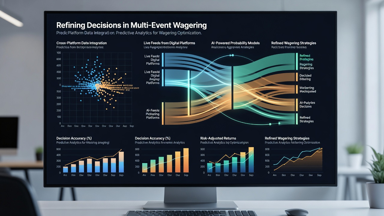
Evidence from controlled observations indicates that participants using visualization software identify profitable multi-event structures more consistently than those working from tabular data alone, and the difference appears in reduced variance between predicted and realized returns across sample sets. Platforms that embed predictive modeling outputs as confidence bands around trend lines give users clearer signals on when to increase or decrease exposure to certain legs, and this process operates identically whether the wager covers digital esports matches or traditional trackside competitions. Industry associations tracking technology uptake note continued investment in augmented reality extensions that project these same visuals onto wearable devices for hands-free trackside consultation.
Future Developments and Data Sources
Developments projected beyond July 2026 include tighter integration with machine learning models that generate automated scenario simulations displayed as branching decision trees, and regulatory bodies in North America continue to monitor how these enhancements affect transparency requirements for odds presentation. One link to broader research appears through the Australian Gambling Research Centre, which examines visualization impacts on wagering patterns, while another reference draws from the National Council on Problem Gambling reports on digital tool usage across jurisdictions.
Conclusion
Data visualization tools have become embedded in the infrastructure supporting multi-event wagering by translating complex datasets into accessible formats that operate consistently across digital interfaces and physical trackside environments, and continued refinement of these systems aligns with evolving data availability from multiple competition types. The documented patterns show sustained application in both settings without requiring subjective interpretation beyond the factual display of metrics and correlations.